DHS Uniform Review: Boys Soccer (Home)
August 31, 2018
Due to the limitations of high school uniform design and the limited resources available to high school teams, some of the following criticisms may be rendered moot.
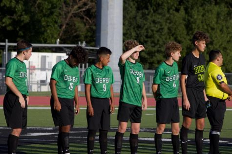
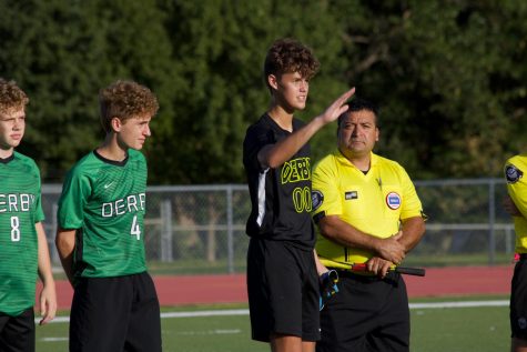
The Derby High School boys soccer team are outfitted with new uniforms this year and they do not disappoint. These new kits are absolutely fantastic. We will analyze the home unis that were worn against Kapaun Mt. Carmel on Aug. 30.
The Jersey
The jersey is obviously the most creative and brandished element of the kit. Its adaption of black with the Derby green, which the school seems to be moving away from, is a step in the right direction. Bringing in the black as a major part of this identity is what makes this uniform so solid.
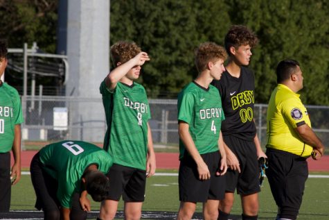
The dashed black lines layered on top of the green base are phenomenal. It’s unique and works extremely well with the green. Two dark shades of color working in tandem like that make the jersey feel bold and strong.
The text is on point too. The black outline on the green base makes the white in the characters pop and separate themselves. This limited use of white in the kit brings focus to the text and supplies a nice accent color to the predominantly green and black coloration.
I’m a fan of the font as well. The “DERBY” feels modern with a splash of animalistic flair. This serves the modern style of the uniform and the “Panther” identity.
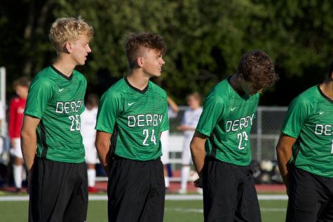
The collars and stripes on the side panels are nice. I love how the black side stripe leads you directly to the all black pants. It’s like a pipeline to a reservoir. When one element of a uniform can lead you to another, it really sets the design apart.
I might want to see a white outline on the stripes and collar to separate them a bit more but what is there now isn’t bad.
Pants and Socks
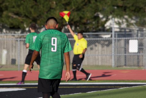
Despite its plainness I really dig the all black bottom half of this kit. It works well with the more flashy tops. If the socks were white, this kit might go from phenomenal to eye-shatteringly beautiful but black is expected and works just fine.
The Goalie
I like it but I don’t love it. I love the idea of adding neon green. It works intensely well with the all black look. On its own, I love the white stripe on the sides as well. But together, they don’t exactly click.
Both the neon green and the white need to be included more in the goalie’s uniform for it to truly work. Having one element of each color makes things feel uncoordinated. Maybe fill the neon outline of the text with white and add a neon outline to the stripe or vice versa.
I appreciate the creativity and boldness of the colors and the goalie kit as a whole. It works well with the standard player uniform. It just doesn’t appear as well as it could.
Closing
These uniforms might be the best I’ve seen of any Derby team. We’ll have to see what the football team trots out this year.
The heavy use of black with the addition of the dark green, which the American football team and the school as a whole seem to be moving away from, is what makes these kits so strong. The bold, modern style make these soccer kits one of the best unis the school has.


