DHS Uniform Review: Ranking the 2018 Football Unis
December 4, 2018
13. Sub-State (White-Green-Black)
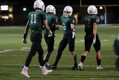
At first I was not a fan of this look but it’s starting to grow on me. The white in the numbers does get brought up by the helmet and the black outline matches with the pants. I do appreciate the effort to find a new uni combination every week but I don’t think the three different colors work flawlessly.
12. Week 2 (Green-Camo-Green)
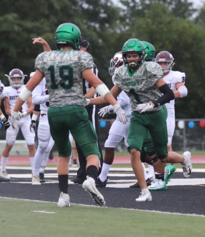
These camos are cool and unique but they are a little rough. The green helmet and green pants pair well with the camo jersey but the collar elements and the number and text color don’t quite work. I really dig the idea though.
11. Week 1 (Green-Green-Black)
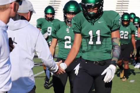
All of these looks are pretty good, none of them are truly “bad”. So despite this uni’s relatively low ranking it’s still a solid look. The green and black are a great combo and those helmets look beautiful in this set.
10. Week 3 (Green-White-White)
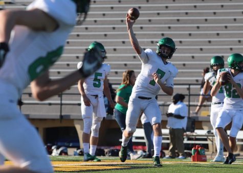
SUPREME CLEAN ALERT. These things are pretty kickin’. The green helmet brings up the color in the numbers and strengthens the uniform.
9. Week 6 (White-White-Green)
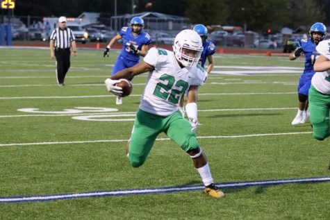
The variation of the color flow on these is nice. It’s essentially the same concept as the Week 3 unis above with one color element pairing with the number color, this time it’s just reversed with the helmet and pants. I like this better though. The plain white helmet provides a more classic look that I think works well with the shade of green.
8. Week 7 (Green-Green-White)
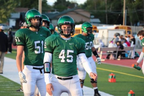
For once the black belt doesn’t throw everything off! It finally serves a quality role as a tertiary color. Black facemask and chinstrap, black outlining on the numbers, black belt. It works! And the green flow with the white block on bottom works with the white lettering and numbers.
7. Sectionals (White-Green-Green)
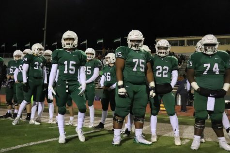
Once again, same concept as above but different colors. This works better. Despite how fantastic that gradient green helmet is there’s something about the white helmet that’s powerful. The plain helmet white goes with the plain number white and that mono green from the neck down looks hardcore.
6. Regionals (Green-Green-Green)
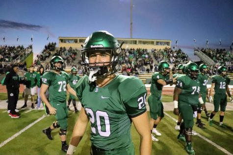
Speaking of mono green, here we are! The fauxback look is in. That classic plainness with a little dash of modern sensibility is really “in” with the uniform world now. And these are what’s going on. That classic monochrome uni set with that gradient green helmet is exactly what I’m talking about. Big time.
5. Week 5 (Throwbacks)
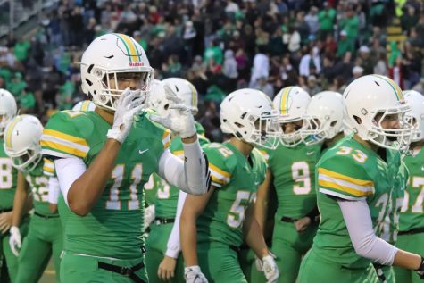
The shoulder stripes are a little off and the unfortunately obligatory black belt is present. But other than that these are stunning. Yellow, green, flat, classic. Plus they have customized knee-high throwback socks. Everything about this look is locked in.
4. Week 4 (White-White-White)
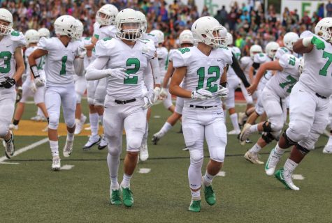
The stormtrooper is never bad. Always great. All-white is what the uni is all about. If you can pull that off with your uni set, you’ve done it. You’ve sealed the deal. And they did. Clean and professional. So good.
3. Week 8 (Green-White-Green)
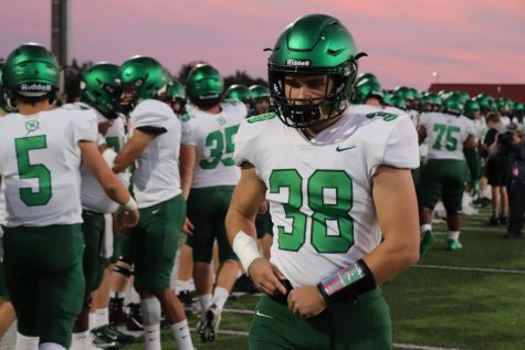
These uniforms are really strong. There’s so much color you’d almost think it was a home set but that away white is what makes it. The white pops and the green numbers hold everything together matching the helmet and pants. Real fresh.
2. Week 9 (White-Green-White)
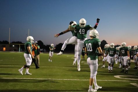
These surprised me. All that white looks so clean for a home uniform it’s eye catching. The green acts nicely as a secondary backdrop to the white elements.
1. State (Throwbacks de nuevo)
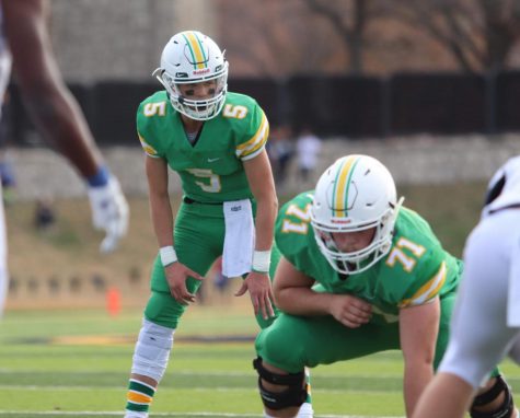
It’s one thing to wear the throwbacks. It’s one thing to be just about the only team in the state to have throwbacks. But they wore them to the state championship game. And won the game. In throwbacks. Wearing throwbacks is already disrespectful. You’re showing the other team just how many threads you got, and how many they don’t. And then on top of that it’s on the biggest stage in your sport. And you win the thing. Ice. Cold.
Credit to the radically apt Erin Kooser for the photos.


