DHS Uniform Review: Girls Basketball (Home)
January 14, 2019
Due to the limitations of high school uniform design and the limited resources available to high school teams, some of the following criticisms may be rendered moot.
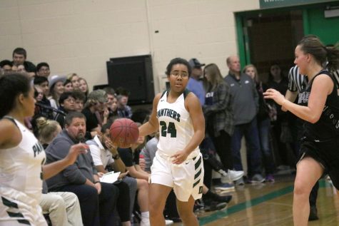
We’ll be taking a look at the girls basketball team’s home uniforms. They’re as clean as that currently undefeated record (8-0).
Jersey
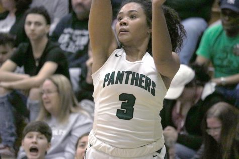
Can never go wrong with that white! Unless you’re one of those schools that does cream. Gross.
But these aren’t that nasty cream. The solid white serves as a great drop to the dark letters and numbers. Dark green with a black outline doesn’t necessarily pop and could be better. But with a green, black, and white color scheme you are kind of limited once the white is used as your primary.
Perhaps white fill with a black or dark green outline (hit me with that Icy Hot)? That has some serious potential to be killer.
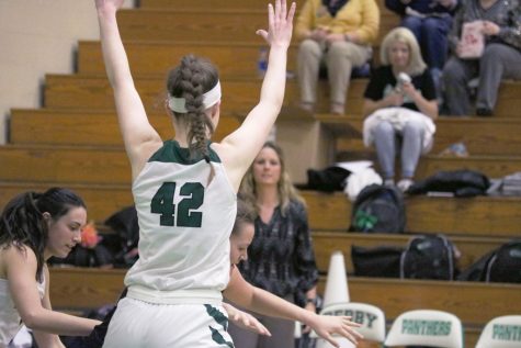
Supremely dig the dark green color block along the shoulders. It’s a unique element that only basketball unis can really pull off effectively. It works well with the lettering and numbers to help tie the green elements together.
Also bonus for no wacky fabric paneling or textures anywhere on the jersey. Basketball unis can be bad about that (proceed to shorts).
Shorts
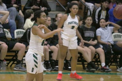
White on white is sweet on… sweet. It looks good.
I like how the green is utilized as the dominant secondary color. It’s well established and matches with the jersey. I do like the “D” on the shorts but it is beyond basic. Looks nice and clean, but boring. A fancy font or nice panther head would be a solid replacement.
We got some issues on this side striping. Like I said earlier about textures, basketball unis like to put them in places they don’t belong. Why are there dots? They aren’t anywhere else and dots as an abstract concept doesn’t scream Derby or panthers to me. They gots to go. They also are not in between every stripe, definite no go.
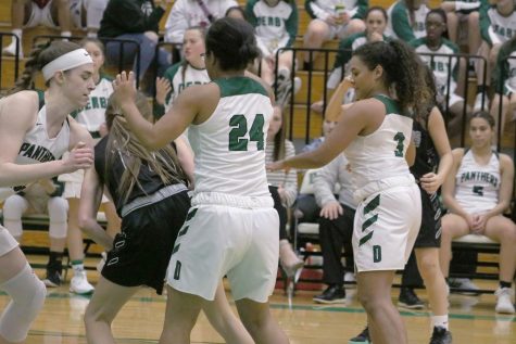
And the slash stripes are in the same boat. I like angles and slashes as a concept. Panthers are predators. Angles and slashes entail striking movement. It works. If you do it all the way and in the right way. This slash element is only included on the shorts, no where else in the uniform and isn’t particularly memorable as far as slashes go.
Has anyone seen those black sweats the girls team wears? Those have some straight sick white block side elements on them. Imagine those running up the shorts.
Closing
These uniforms are still solidly good despite my criticisms. That and I saw what happened to the last 8 teams that opposed them so calling them bad isn’t really an option for me if I want to remain undestroyed for the foreseeable future.
I took all the photos this time.


