DHS Uniform Review: Boys Basketball (Home)
January 16, 2019
Due to the limitations of high school uniform design and the limited resources available to high school teams, some of the following criticisms may be rendered moot.
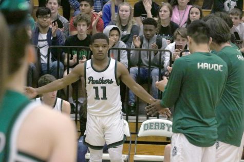 We’ll be taking a look at the boys basketball home unis.
Jersey
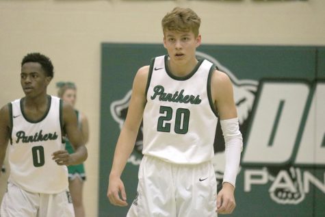
It’s basketball so white is expected. It looks as nice as ever.
The design is very simple, almost too much so. There’s really nothing to talk about here and doesn’t lend itself to a high level of memorability.
The dark green and black work fine, they’re in the same boat as the girls home unis. Its okay but leaves more to be desired.
I think in this instance with the boys unis the dark green on black actually works better because of the outlines on the neck and shoulders. The black on green in the lettering is tied together by the outlining.
I sort of dig the cursive font. The classiness that basketball culture entails allows you to do something like cursive as an element. I think it works but I don’t know how it ties to Derby or a panther.
Shorts
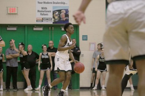
Once again, as all unis go, the all white is crisp.
The shorts got some issues though. I’m a fan of the chevron cut on the shorts and I appreciate how the dark green and black outlining is consistent on the shorts.
Just like the girls home uniforms they have a weird dot texture down the side. It’s no where else in the uniform and doesn’t particularly work as an element.
The logo on the top of the side of the shorts is cool and I like the “D” with the panther logo. But something really wrong happened there.
The logo has a grey fill. Grey is no where else in the boys basketball identity. The fill really needs to be white.
Closing
This look for the boys basketball team is a good one. I’ve seen much worse from other teams out on the road. There’s just a few missed opportunities and some oddities that detract from it.


