Derby High rebrands with new graphics
September 29, 2019
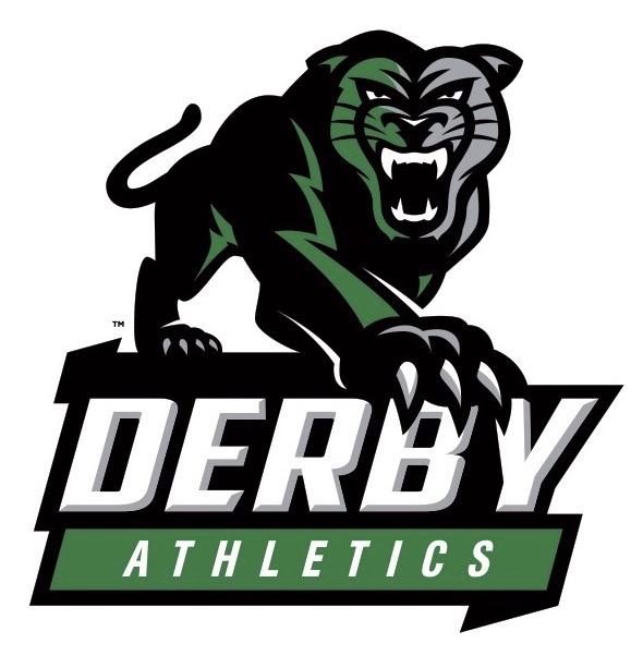
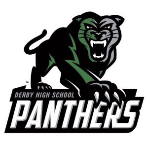
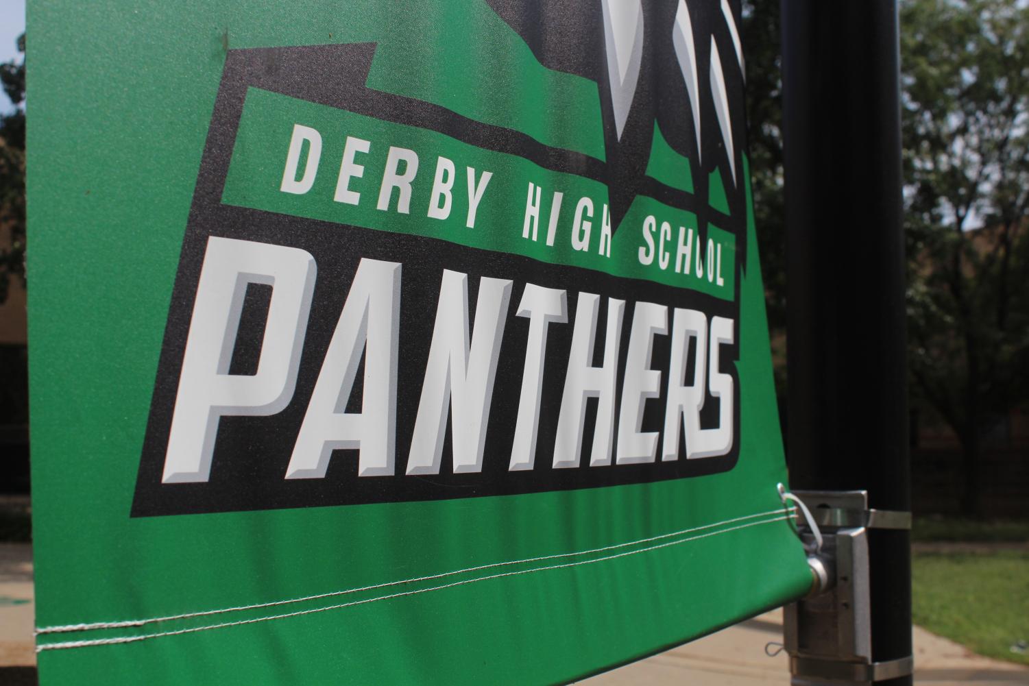
Derby High is rebranding itself with new graphics designed by VIP Branding.
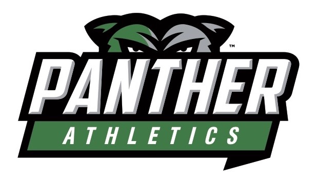
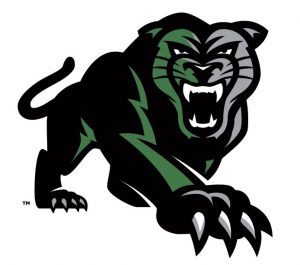
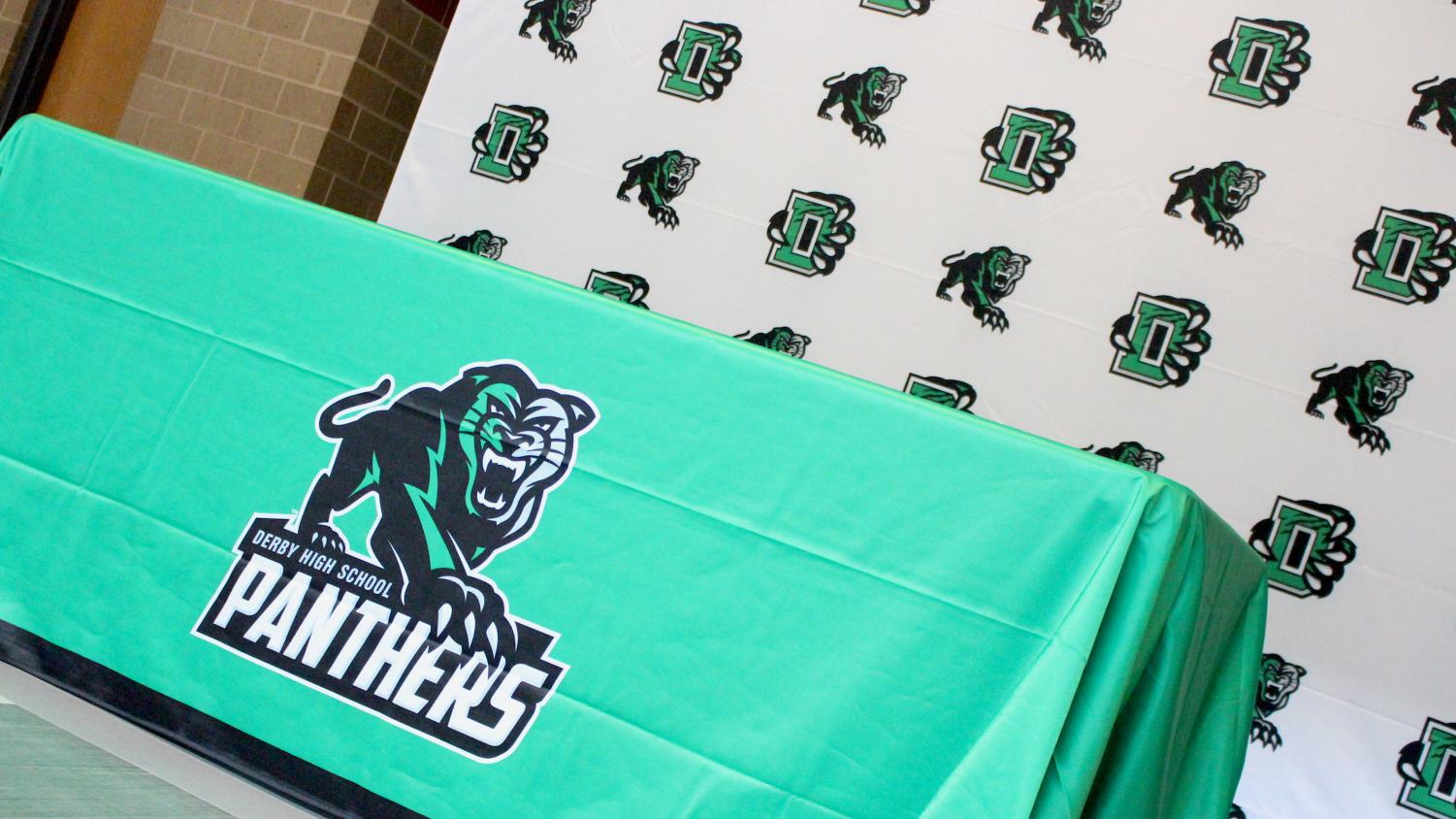
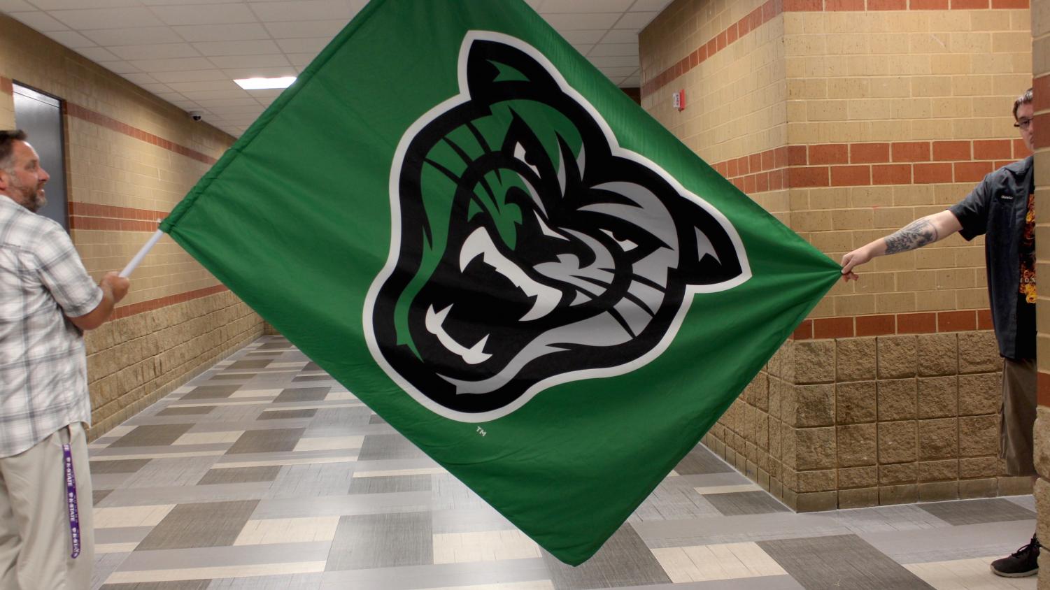
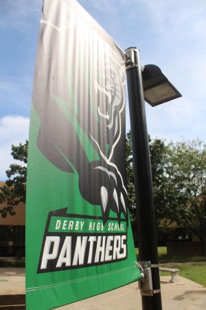
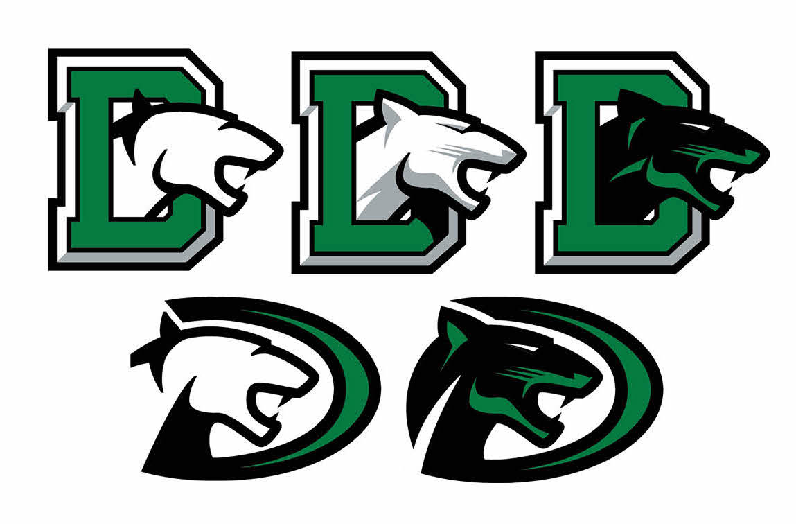
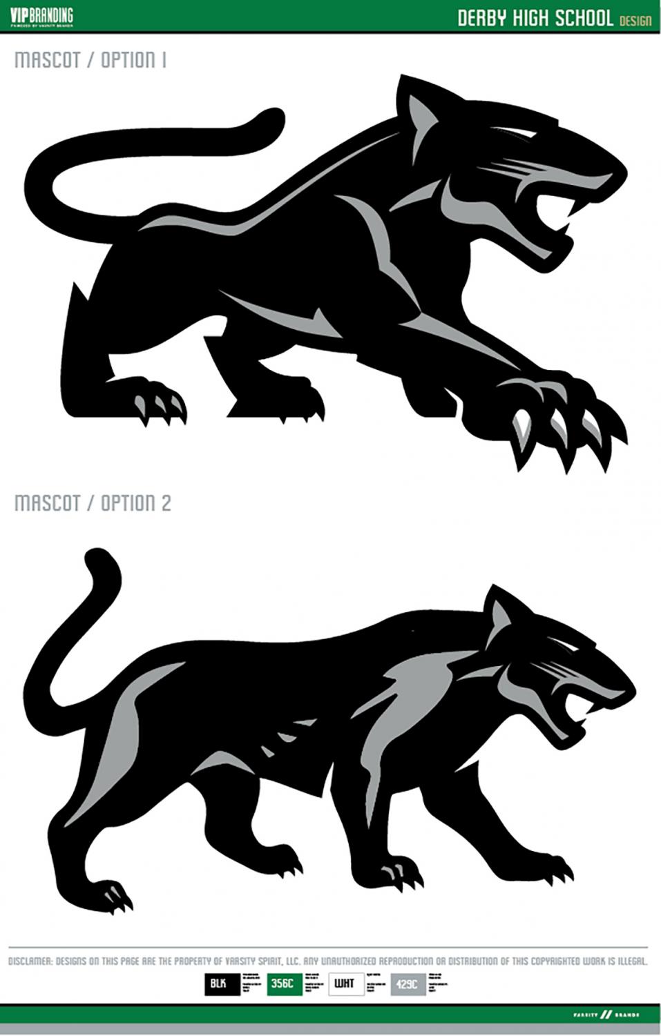
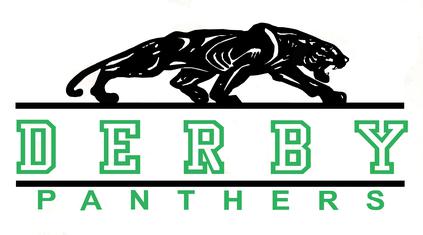
The collection of graphics has realistic Panthers with fierce teeth and claws. One Panther has a full body, one has just a head, and another’s head peeks above the words. The left side of the Panther’s face is green and the right is grey, with the grey starting slightly past the halfway point on the left.
“I like how the Panthers project terror,” senior Aiden Beach said. “It reminds me of how fearsome our school spirit is.”
Junior Sophia Best added: “It’s definitely interesting. That’s a really weird lighting angle if there is black, green and silver. I would have preferred if it was all like black and green, instead of just like that awkward silver.”
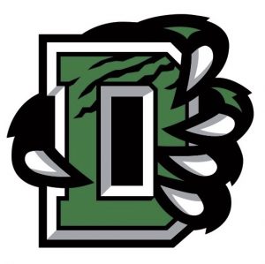
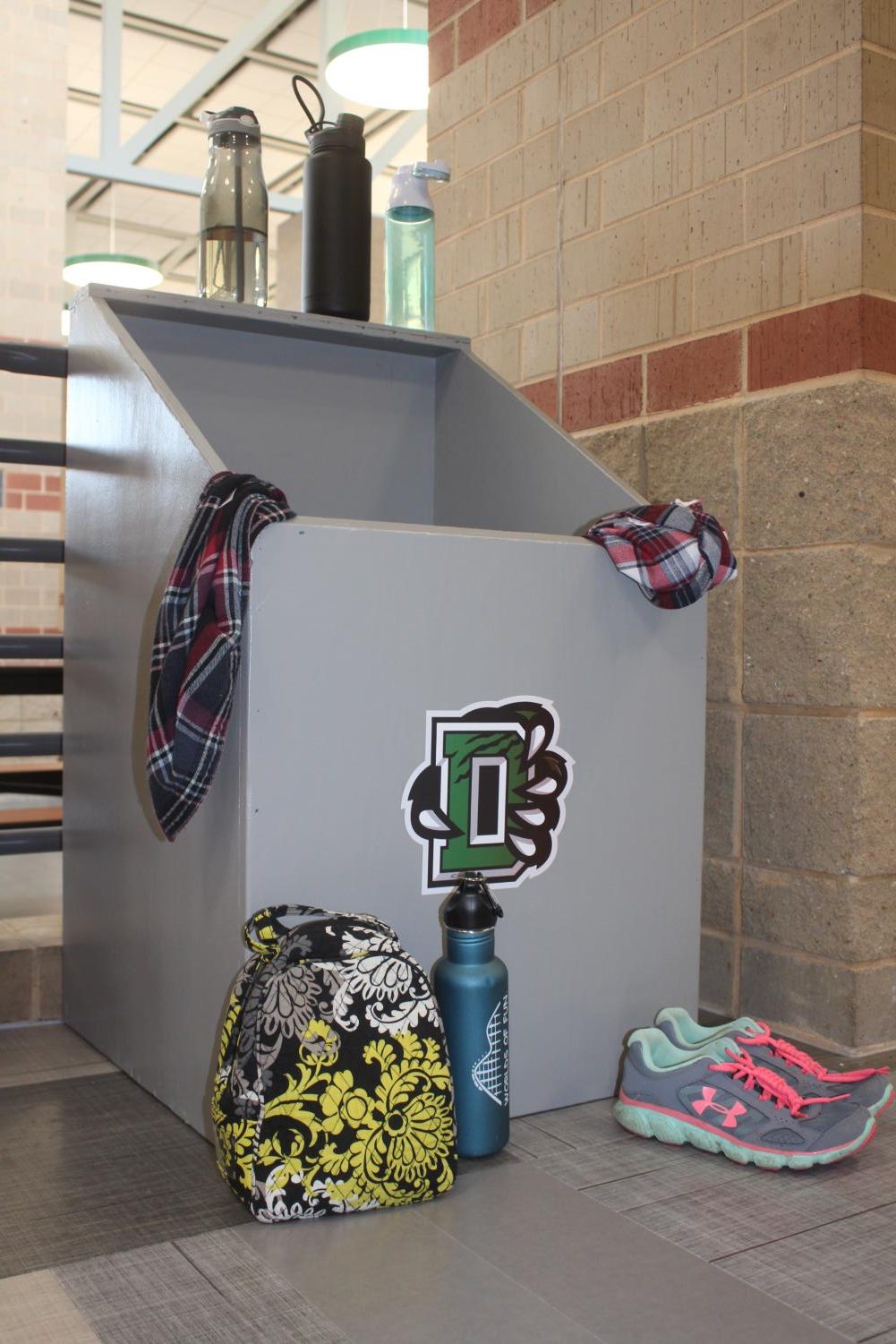
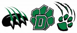
Best’s favorite was the D with a claw.
“I’m going to be honest. I prefer that one — simpler, cleaner, no awkward effects like that silver.”
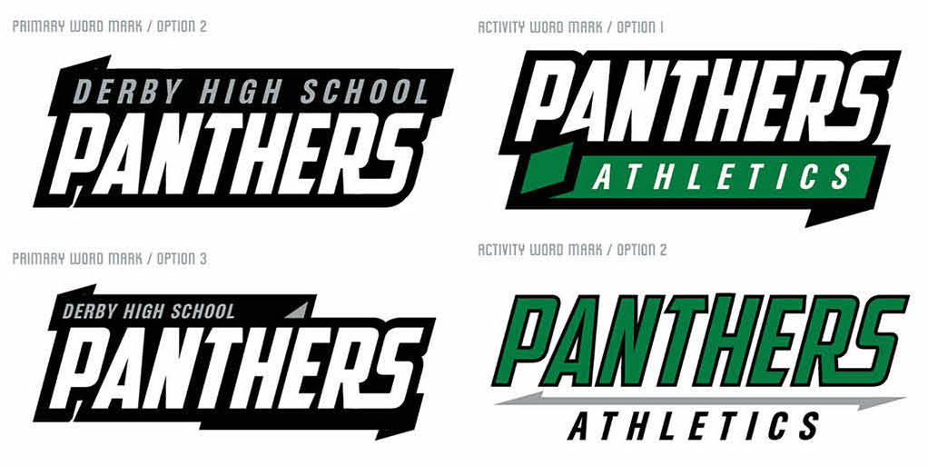
The lettering is italicized and capitalized in fonts AgentConDB Normal and American Captain. The graphics are colored in kelly green, black, white and silver grey. The grey is used for for shading on the white letters and to contrast the green half of the Panther head.
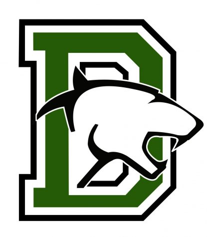
The green capital D outlined in white and black stays as a primary, unofficial logo and will continue to be used on uniforms. The new graphics will be used for merchandising, including spirit shirts and sweatshirts.
According to athletic director Russell Baldwin, Derby High has never had an official logo.
“We don’t have an official school logo, but if any of the logos that we have are official, it is the block D that you see everywhere… that’s been around for decades and decades, decades,” Baldwin said.
The evolution of Derby graphics is evident in the athletic office, where there are Panthers as far back as the ’70s. Baldwin estimated about five Panthers, including the D, have been used in the past 10 years.
“Now over the years, the mascot kind of changed, the graphic that people use,” Baldwin said. “And so that’s why we use the term graphic instead of logo because a logo is something that is kind of (an) official thing.”
Derby did not intend to rebrand until Varsity Brands proposed the idea. The company started in California and wanted to expand into Kansas.
“Derby is pretty famous in Kansas for being good in athletics and activities and academic,” Baldwin said. “And so what they wanted to do is kind of use this as a showcase to get other schools in the area to use BSN, Varsity (Spirit) and Herff Jones.”
BSN, Varsity Spirit and Herff Jones are all part of the Varsity Brands company that Derby already uses. The graphics were designed by VIP Branding, which is the marketing company for BSN, Varsity Spirit and Herff Jones.
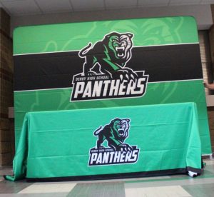
An incentive was that the work, typically priced at $20,000, would be done for free. This includes multiple graphics, a branding guide and other products. A branding guide is used for other companies to know exactly how they are allowed to modify the graphics if necessary for shirt printing or other uses. Products include flags, table cloths and media backdrops.
Comparatively, according to Baldwin, Stone Creek Elementary School recently paid $5,000-$6,000 for their logo, which is on the lower scale of pricing.
Another reason was that, unlike the previous Panthers used, these graphics are trademarked.
A committee — which consisted of Baldwin, along with swim and cross country coach Jimmy Adams, football coach Brandon Clark, principal Tim Hamblin and school board members Matt Joyce and Mark May — decided the specific details of the graphics.
“It was cool to get voted in by my other coaches to represent our school,” Adams said. “We kind of were all vibing… and just kind of all started spitballing stuff so it was a group effort. None of us can take credit, but like, ‘hey, let’s put this on there’ and we’re just throwing stuff out and that’s kind of how it went.”
Baldwin added: “We went through this whole process of ‘what do we like, what we don’t like.’ Do we want a front-facing Panther? Do we want to do just a head?”
They experimented with countless versions. The Panther head started with a tongue and without eyes. They asked to add shading to the originally plain words. One committee member liked the D with claws and the designer added scratches to it.
“I like it. It’s a fresh look. I wouldn’t want to give up some of our traditional stuff. I’m not even from Derby and I feel like a little nostalgia toward it, been here for 10 years,” Adams said. “But I like it. I think that we put it on some signs and stuff like that from cross country, so it was pretty cool. It’s making its way around.”
Creating these graphics was a two-year process, beginning on August 27, 2017, and completing on March 26, 2019. According to Baldwin, the company said it usually takes two to three months.
“We wanted to make sure that if it’s going to be done for free, it’s not cost(ing) anything, then we’re going to take our time to do it,” Baldwin said.


