DHS Uniform Review: Football (Week 1)
September 3, 2018
Due to the limitations of high school uniform design and the limited resources available to high school teams, some of the following criticisms may be rendered moot.
Much like boys soccer, the Derby High School football team got some new unis too. We’ll be looking at the uniform combo the Panther football team suited up in against Garden City on Aug. 31. They’re poppin’.
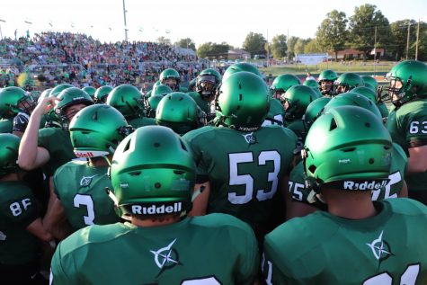
The Helmet
Look at these beauties.
Look at them.
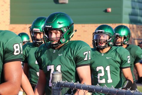
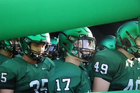
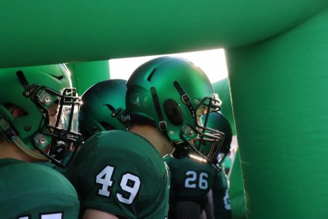
The dark green matte helmet got a new coat of paint and it is positively sensational. The new coat appears to be this sort of brushed gradient ranging from light to dark green, although the color changes under different elements of light so it’s hard to say the exact shade or shades they’re painted.
This makes the new helmets even greater. How the color reacts and changes under light from the sun and stadium lights makes the uniform uniquely dynamic.
The black facemask and chin straps make the whole helmet pop and offers the perfect contrast. The black elements of the helmet also help bring out the black outline on the jersey text.
The Jersey
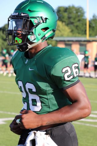
The jersey is pretty fantastic too despite the simplicity. The use of the darker green really flows well with ever-changing, lighter shades of green on the helmet
The helmet is like the leaves of a tree, swinging and changing while the jersey acts as the trunk. Having the strong, dark shade as a base ties the uniform together and allows the green on the helmet to move freely and work with the rest of the uniform. The differing shades, dark on bottom and light on top, help avoid the green on green from becoming a single color overload.
The bold white “D” on the collar is a nice touch.
The numbers are solid. The font is nothing special but it works just fine. Black outlines on dark green always works, especially if you have white characters, despite them both being dark colors.
Above the numbers is the logo for the football’s community outreach program called “One Degree”. The logo design is nice and the colors work but there are a few things off about it. I’m not questioning its place on the uniform or the importance of the “One Degree” initiative just its placement and status as a uniform element.
The spacing on the back, above the numbers is odd. To fit the “One Degree” logo they had to make the space large despite the logo being more vertical, creating this odd, wide empty space.
The best placement of the logo would probably have been where the white “D” is located now, or perhaps even two “One Degree” logos on the shoulders instead. Although that’s drawing a lot of attention to a logo that isn’t necessarily a part of the high school or overall Derby Panther identity. Two large logos on the shoulders would normally be reserved for something like a panther head or a big “D” logo for example.
The Pants
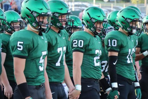
The pants are black. I like it. The color black works really well as a secondary color with this outfit and the pants bring it together. Since there are black accents on the helmet and jersey having black pants makes the uniform click.
A white belt might bring the numbers out more and make the uniform more interesting but a black one does the job.
Closing
These uniforms are truly outstanding despite the minor critiques. The helmets are fairly superb and my eyes shed a thick tear that shimmered green from their glorious reflection when I first witnessed them.
As I’ve stated before, bringing the dark green and black back to the forefront of the school’s visual identity is a better direction than the light green, yellow fauxback way we were trending. The dark green and black look is strong, unique, and more modern in a good way.
It’ll be hard to top these.
Credit to the absurdly talented Erin Kooser for the photos.