
DHS Uniform Review: Football (Week 6)
October 11, 2018
Due to the limitations of high school uniform design and the limited resources available to high school teams, some of the following criticisms may be rendered moot.
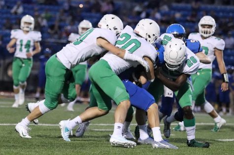
The Panther football team had a solid look against Hutchinson on Oct. 5. They still outclass what anyone else is wearing and although we’ve seen all these uniform elements before this new combo looks great.
Helmet and Jersey
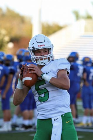
They look clean as ever. White helmet and white jersey work to perfection. White on white has a nice flow and it isn’t interrupted here.
The green numbers add a nice splash of needed color and its contrasts well with the white.
The Pants
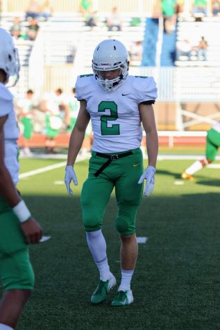 The green pants with the white jersey works fantastically except for a few things.
There’s a solid color base with the green on bottom and the all white on top. It makes these uniforms feel strong with a dark color foundation below which allows the light colors to wander freely on top.
Also, the green on the numbers and the pant green matches which is an absolute necessity. I don’t know if they’re a dark green or light green school but THESE specific greens do happen to match.
Just some minor gripes that no one cares about but they drive me crazy. Black belt. You have to lose that for white. Black is nowhere else on this uni. It breaks the flow with the dark belt color on dark pant color and white would make the whole thing pop.
And the yellow swoosh. Oh please, don’t do this to me.
Closing
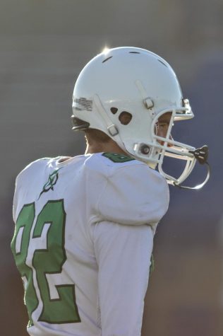
Sick photo here cause why not? #Linus #Legend
This uni combo looked big time pretty out on the field and although it’s not the flashiest uni we’ve seen it still looks high and fly.
Clean, professional, and Derby. It was a good look.
Credit to the super photo-dexterous Erin Kooser for the photos.