
DHS Uniform Review: Football (Week 2)
September 9, 2018
Due to the limitations of high school uniform design and the limited resources available to high school teams, some of the following criticisms may be rendered moot.

AMERICA!!!
The Derby High School football team wore some freedom induced threads on Sept. 7 against Salina Central for military night.
I heard they were going to change up the pant and helmet combo with the camo jersey this year and I was skeptical. I shouldn’t have been.
The Jersey
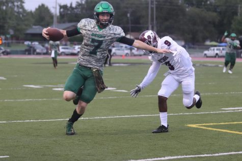
Thanks to the new helmets and different pants, the jersey is allowed to finally breathe this year. And it truly shines.
The digital camo is fantastic. It always looks cool on anything. The shade of the camo is crucial here. Going with a muted green/tan look works well with dark green and black.
Something that didn’t look great in the past but really stands out and excels now is the green and black elements of the camo jersey. The green collar and sleeve bottom tie the whole uniform together. Without them this would look like a mismatched identity.
The sleeves and the collar, and the green in the text and numbers, lock the jersey together with the helmet and pants, especially now that the helmet is a lighter shade of green that better matches the green detail on the jersey and the pants.
The black outline and black numbers work smoothly for the first time since these jerseys debuted. In the past, the camo pants with the camo jerseys created this camo overload that not only made the green feel out of place but made the black elements feel slapped on and aimless.
Now with the camo and the green shouldering an equal color load, the black feels like a true accent color. The black on the text is brought out by the black facemask and it feels like a matching identity.
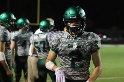
Helmet and Pants
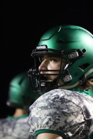
I already talked about how much I love the helmets.
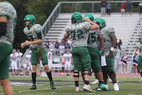
The pants and the helmet were the missing pieces to this uniform. And they found them. The plain green pants work nice and the shades from the helmet, the jersey, and the pants mix well.
The green on the pants and the green on the jersey are different and that would really take away from the uniform if it wasn’t for the brilliance of the helmets.
That gradient green brush and how it reflects light allow the helmet to match with both the green jersey details and the green pants.
The dark green shades on the helmet pull the green on the pants up and the lighter shades on the helmet pull the jersey green up, fashioning it all together like a bow wrapping around a present and tying at the top.
It’s a strange phenomenon but if you follow the bottom of the pants, up though the jersey, and to the top of the helmet the colors flow despite their different shades.
Closing
These things are just mean. Camouflage always evokes feelings of the military and therefore strength and power and these uniforms harness that and use it.
But what’s truly special about this isn’t camo jerseys but how the helmet, pants, and accent elements dance around it and bring the identity together.
This should be the standard look for military night from now on.
Credit to the supremely gifted Erin Kooser for the photos.