


DHS Uniform Review: Football (Week 3)
September 19, 2018
Due to the limitations of high school uniform design and the limited resources available to high school teams, some of the following criticisms may be rendered moot.
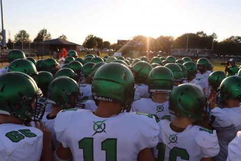
The Derby Panther football team was looking mighty clean on Sept. 14 against Newton. Let’s take a look at them.
The Jersey
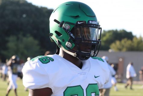
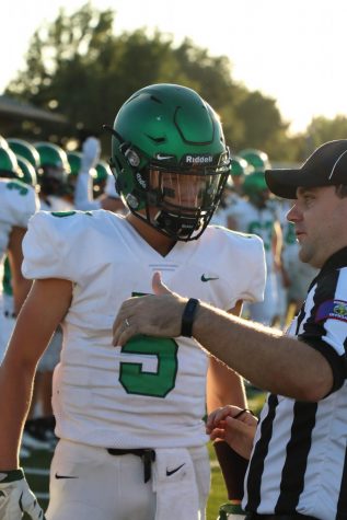
These jerseys are plain slick. They’re also sick. In a good way. The multi-green approach is something I’m a big fan of.
The way the dark green outline and the light green fill work together is flawless. It’s extremely clean and they pop on the white base. They also work perfectly with the helmets as the two greens mimic the two predominant shades of the helmet.
We also have shoulder elements! They’re numbers! They look fantastic just like the numbers on the front and back. I love shoulder elements, without them uniforms typically feel a little empty.
The collar is okay with the off-white lines on the bottom peak of it. A nice two-green “D” would be nice there to match it with the green unis.
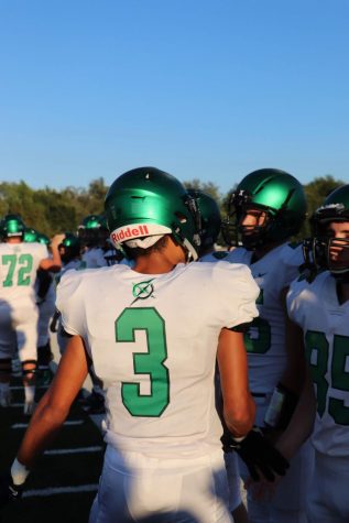
With these jerseys we have a return of the “One Degree” logo. And it works! Somehow!
The logo and what is represents aren’t in question here, just its placement and status as a uniform element.
On the green jerseys I had a problem with its placement, it felt awkward on the back. Now it looks pretty solid. The two-green color to match the numbers looks legit and it rests nicely just slightly above the center of the numbers.
I think it might be smaller than it was on the green jerseys as well. There’s less of a strange gap.
On their own these unis are dope as the devil’s basement. But there’s one big issue here.
NONE OF THE UNIFORMS MATCH.
All of the looks are typically phenomenal and this week’s is no exception but they don’t follow an identity. Alternate uniforms are one thing, like the camos or the throwbacks. They don’t have to match. But the home and the away really, really need to.
What are the colors of the Panther identity? Is the primary color dark green, is it light green? Is white the secondary color? Is black apart of the color scheme? Is it possible that even YELLOW is in there too?
The uniforms individually are gorgeous but there is no synchronized, common branding or identity to them. The home greens and away whites should really just be inverted color versions of one another. Pick a two or three color identity and leave things like a multi-green for an alternate.
And the home greens and away whites need to have matching elements. The whites have a striped collar and shoulder numbers. The greens don’t have shoulder numbers and have a “D” on the collar. Things like this need to match and be consistent.
The uniforms are stunning though so whatever.
Helmet and Pants
The helmets are still absolutely killer. I love how they pair with the green on the jerseys.
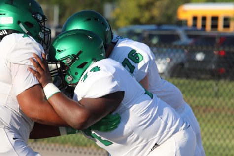
The white pants with the white jerseys are great too. The monochrome look from the neck down allows the helmet to bring out the greens and let them shine.
The black swoosh on the pants is mismatched with the dark green swoosh on the jerseys and it bothers me more than it probably should.
With the multi-green approach the black facemask and straps on the helmets look a little out of place but black can blend well with most things so it isn’t bad.
Closing
Despite my ranting about a mismatched identity these uniforms were downright nasty on the field. In a good way.
They look clean, sleek, and the green helmet brings the primarily white uniform a level of boldness.
Credit to the brilliantly skilled Erin Kooser for the photos.